the costume design in this opening was possibly the main highlight of this spectacle that i wanted to portray. I put a lot of thought into the style and feel of the outfits through much research into western, sci-fi, kung fu and period drama movies. At first, the music video, "Knights of Cyndonia" by Muse had the broadest selection of imagery that i was looking for. afterwards i moved on to fine tuning the ideas, taking inspiration from movies like Mad Max with it's post-apocalyptic futuro-tribe feel and Pirates of the Caribbean with it's heavy use of jewelry, charms and other cultural accessories.
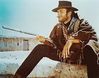
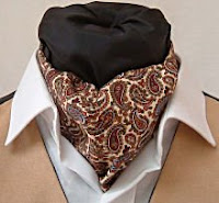
I did a couple of drawings in my sketchbook to visually piece together what i was looking to achieve - a sort of bohemian, rugged mish mash of styles and luckily my mum and dad had a lot of the garments i was after (from way back when they were new romantics and post punks) e.g. cravats, cowboy style apparel and chunky belts. A lot of the clothing also came from me and my friends too - Max (Bandit) had about 5 different ponchos up for selection that he'd bought back from a recent trip to Mexico, I had a real nice pair of desert boots, Levis 501 jeans and some good shirts while Angus (cowboy) had a really beefy leather duster coat - the kind worn by the Clint Eastwood.
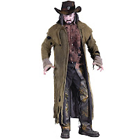
When we put all the stuff on it took time until we had it perfect, just how i wanted it, but when we did it was truly cool. check out the photos i posted for a brief glimpse.
2. Lighting:
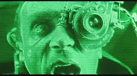
Luckily where we filmed had these great bright red heat lamps all over it as the space was often used as a scout hut - it gave a nice red highlight upon the actors giving the look a bit of depth rather than blunt white light. it also went nicely with the eventually dropped in space background.
The look achieved from this red tinting reminded me slightly of 2001: A Space Odyssey were the astronaught has to go into HAL and everything becomes super psychedelic.
It was great though as i'd actually forgotten about these heat lamps, so when we did shoot the visuals were accidental but beneficial, giving the genre a slight push in the direction of sci-fi (like Pitch Black with it's multiple different colored suns) but also fantasy (like The City of Lost Children's high usage of tinting).
3. Framing:
I didnt want framing to be such a major role as otherwise i felt the spacey, sci-fi edge could've been lost. also, with the use of bluescreen, actors can be filmed separately but placed together in the same shot therefor composing the imagery out of camera rather than in - this proved fairly tricky but i conquered the issue by placing both actors together in one shot for focus/size/zoom references, then filming them separately for layering them up to match the first guide shot - having them in layers like this was handy though as i could place pyro effects more authentically into the film without them spilling from background to foreground.
4. Setting:
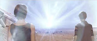
I chose space not for a futuristic feel but rather for a fantasy one. i wanted it to seem more like an otherworldly place like heaven or some kind of shaman afterlife where you could still stand a have realistic physics but there was no ground or walls, just infinity.
It really added to the psychedelia of the film, truly making it visually impressive but also elusive - i partly got the idea from The Matrix, were Morpheus and Neo are in a training sim where all around them is white except a few objects.
It creates a disorientating edge as your eyes dont see ground/wall or sky markers but you mind makes virtual ones through guessing and perspective.
5. Camera shots:
Most of the shots in the film were steadied via a tripod or table top. i ewanted them all to be still as visually you wouldnt really expect hand held motion + blur in a supposedly weightless, stereotypically slow motion space setting - it just wouldn't fit in.
at a couple of points though it was filmed handheld, though very steady so instead of looking wobbly it looks more like a crane e.g. the shot climbing up the cowboy and the overhead one where he strikes a match. surprisingly the shot where it appears that the camera is rotating around him was actually done by keeping the camera still and having him pivot around 180 degrees in front of bluescreen.
6. Transitions:
i didnt use fades from shot to shot. instead i seperated the shots with credits/titles. after the initial introduction of corporations involves the film jumps into the action and the cross dissolves into black background credits stop, being replaced by quick shots of the cowboys cape and beads swaying with his motion, adding a nice sense of fluidity in his motion inspired from kunk fu films like Hero and Crouching Tiger were the motion is turned more into an art form.
this just added to the cool laid back emotiveness the cowboy gives off as it makes his movements calm and collected. in terms of genre i'd stay it sticks close to western aswell as gangster, introducing main characters subtly and smoothly allowing mystique to build up.
7. Special FX:
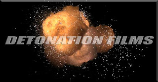
The FX was fairly simple to do. i simply downloaded free stock footage from www.detonationfilms.com, then keyed out the black backdrops, allowing them to be placed on top of the footage or inbetween layers of footage as described earlier.
the effects work really nicely - i used them to show the gun firing but also the impacts. i wanted to replace blood with fire, as if the possessed bandits he's fighting are truly demonic. My favourite effect used was a sparkler - when keyed it looked like spewing flames and heat so i used it to simulate a spurting effect from the impact points.
8. Typography:
I chose a simple font for the credits leading up to the main title as i didnt want to detract too much from the other main visual imagery. however, after uploading it was reccomended to me that i shouldve made the text king over the footage as unfortunately rather than looking like an opening it seemed more like a promo. It was sugessted that i should maybe freeze scenes of action and have the credits come in with the same aesthetic style as the background - keeping the theme of free, floaty, stardust like motion.
The main title at the end i compiled on photoshop - aiming to make it look similar to an old video game logo or animation title, keeping a slightly 70's/80's theme consistent. A good example of what i was targeting is the titling of Beverly Hills Cop as the scruffy text and structure has a jagged and action packed feel, fitting nicely with my main array of targeted genres.
5. Camera shots:
Most of the shots in the film were steadied via a tripod or table top. i ewanted them all to be still as visually you wouldnt really expect hand held motion + blur in a supposedly weightless, stereotypically slow motion space setting - it just wouldn't fit in.
at a couple of points though it was filmed handheld, though very steady so instead of looking wobbly it looks more like a crane e.g. the shot climbing up the cowboy and the overhead one where he strikes a match. surprisingly the shot where it appears that the camera is rotating around him was actually done by keeping the camera still and having him pivot around 180 degrees in front of bluescreen.
6. Transitions:
i didnt use fades from shot to shot. instead i seperated the shots with credits/titles. after the initial introduction of corporations involves the film jumps into the action and the cross dissolves into black background credits stop, being replaced by quick shots of the cowboys cape and beads swaying with his motion, adding a nice sense of fluidity in his motion inspired from kunk fu films like Hero and Crouching Tiger were the motion is turned more into an art form.
this just added to the cool laid back emotiveness the cowboy gives off as it makes his movements calm and collected. in terms of genre i'd stay it sticks close to western aswell as gangster, introducing main characters subtly and smoothly allowing mystique to build up.
7. Special FX:
The FX was fairly simple to do. i simply downloaded free stock footage from www.detonationfilms.com, then keyed out the black backdrops, allowing them to be placed on top of the footage or inbetween layers of footage as described earlier.
the effects work really nicely - i used them to show the gun firing but also the impacts. i wanted to replace blood with fire, as if the possessed bandits he's fighting are truly demonic. My favourite effect used was a sparkler - when keyed it looked like spewing flames and heat so i used it to simulate a spurting effect from the impact points.
8. Typography:
I chose a simple font for the credits leading up to the main title as i didnt want to detract too much from the other main visual imagery. however, after uploading it was reccomended to me that i shouldve made the text king over the footage as unfortunately rather than looking like an opening it seemed more like a promo. It was sugessted that i should maybe freeze scenes of action and have the credits come in with the same aesthetic style as the background - keeping the theme of free, floaty, stardust like motion.
The main title at the end i compiled on photoshop - aiming to make it look similar to an old video game logo or animation title, keeping a slightly 70's/80's theme consistent. A good example of what i was targeting is the titling of Beverly Hills Cop as the scruffy text and structure has a jagged and action packed feel, fitting nicely with my main array of targeted genres.

No comments:
Post a Comment