in what ways does your media product use, develop or challenge forms and conventions of real media products? (i.e. of film openings)?:
Use:
-jumping sttaight into action - like james bond intros
-establishing special effects at films disposal at intro
-keeps main character hidden/unknown, sucking audience in
develop:
-works heavily on over the top FX, almost to comedic level
-outfits over done to comic style, gives more vivid/rapid introduction to styles being conveyed.
Challenge:
-challenges most modern day "gritty" realistic movies and goes for a more naive action packed 1970's styled opening - could be considered ironic e.g. anchorman.
How does your media product represent particular social groups?:
i felt that the movie would appeal more to the rock oriented crowd due to the clothing choice and 1970's film style reference unexplored in most areas of say hip hop/trance..
also i'd say from early teens onwards to 50's as many different aspects of the films themes can be identified throughout the different age ranges e.g. cowboy westerns, Muse (rock band with similar music video), john woo films.
What kind of media institution might distribute your media product and why?
Most probably an advert/trailer sector due to this project showing off more of it's USPs like action and SFX instead of luring the audience in with conventional film title opening sequences.
i also feel rahter than a film company - a series company could adopt it better as the opening worked much like the opening of spiderman or batman, picking up from the comic as everybody already understands the rough plot outline - this is why it is so easy for the film to jump straight into the action.
How did you attract/address your audience?
i researched into many different programs such as Bravestar, deadwood and monkey for visual inspiration, the rock essence came from Muse's MV knights of cyndonia - all of these programs had a childish edge to them, designed to suck in the audience with imagery rather than thought.. generally found more in male targeted media e.g. Shaving adverts... (showing off cool SFX and sound to demonstrate simple things). adverts targeted around the female audience generally have more chatter and less diagrams to them.
What have you learnt about technologies from the process of constructing this product?
-blue-screen must be very taught and lit gently all over from behind+above the actor for the best keying
-trying to achieve 28 days later esque frame rates always results in exposure dipping from reduced light intake on the camera. unless you in a bright room, it'll begin to look underexposed and therefor noisey, messing up keying.
-stick to a minimum of two, AE has brilliant bluescreening tools but is hard to cut with, FCP has ergonomic quick splicing formats. combining the 2 is good for a visually strong end product.
Tuesday 21 April 2009
Monday 20 April 2009
Character comparison

The imagery i associate the cowboy with most is definitely Jimi Hendrix. It was Hendrix that gave me the "VOODOO" idea, through his songs but also his general apparel (beads, military coats, charms, layers and mixes of materials...)
His presence in psychedelic art and style is huge too - everybody would easily associate with the targeted hippie feel of the film having things reminiscent of Hendrix.
Next i'd say Carlo's Santana with his cool 1960's style (waist coats, drainpipe trousers, chelsea boots) he looked great as if the sharpness of MOD mixed up with the beatles SGT Pepper look..
This time it gives it the cowboy look some more..
Finally Keith Richards. He looks like chewed wire. absolutely everything has happened to him and you can tell through what he wears - a very cultural blend of garments that look like he's just picked them off of various morrocan, turkish and south american markets. it was this "travelled" look that i thought suited the cowboy well - after all.. he had ben to a shaman afterlife, hangin out with the amazonian spirits.
Sunday 19 April 2009
Feedback L2
1.
what kinda genre do you think this film belongs to? why?
-fantasy. i think this because it looks and seems imaginary with all the colors and imagery
who do you think the target audience could be? why?
-i think the target audience for this would be slightly older than myself and most likely male
If you were to borrow one idea from this film for your own film-making project, what would it be and why?
-the colors stand out
2.
what kinda genre do you think this film belongs to? why?
-superhero flick/sci-fi/western with rough colours to qualify as a decent stoner flick, because, well he's a cowboy, in space, being awesome and cosmic, while beinfg surrounded by loads of colours
who do you think the target audience could be? why?
-hippies, cus of the psychedelia
Whats your favourite image from the film? why?
the opening shot crawling up the cowboy, it just hits you with the cosmicness of it all..
If you were to borrow one idea from this film for your own film-making project, what would it be and why?
-Green screen
what kinda genre do you think this film belongs to? why?
-fantasy. i think this because it looks and seems imaginary with all the colors and imagery
who do you think the target audience could be? why?
-i think the target audience for this would be slightly older than myself and most likely male
If you were to borrow one idea from this film for your own film-making project, what would it be and why?
-the colors stand out
2.
what kinda genre do you think this film belongs to? why?
-superhero flick/sci-fi/western with rough colours to qualify as a decent stoner flick, because, well he's a cowboy, in space, being awesome and cosmic, while beinfg surrounded by loads of colours
who do you think the target audience could be? why?
-hippies, cus of the psychedelia
Whats your favourite image from the film? why?
the opening shot crawling up the cowboy, it just hits you with the cosmicness of it all..
If you were to borrow one idea from this film for your own film-making project, what would it be and why?
-Green screen
Friday 17 April 2009
equiptment


Bluescreen: used for solid color to later key out and replace
Final cut: used to color correct image to solidify bluescreen color, also used for splicing of film.
Adobe After Effects: Has far better chroma keying tools than FC, so i did all keying in this. i also compiled the spacey background in AE as that Required good Luma keying to remove the black and layer the up.
Camera: used on high frame rate to allow better speeding up + slowing down via frame blending tools.
Tripod: used to gain steady shots and zooms
Sketchbook: used for detailed storyboards and graphics to be inserted in to animatic
Internet; research/imagery/inspiration for mood board. used for sound fx and pyro effects.
Sound CD: used for great drones and pulses used as soundtrack to film.
I've learnt many things about the filming processes of making special effects in that Bluescreen always needs to be perfectly smooth - ironed if possible, as the smallest crease could create a shadow just out of the keying tolerance level, therefor making you have to color correct to gain the highest solidity of one color (blue) and the color correction even though it may fix the keying problem can have negative effects on the rest of the footage (other R/G/B levels too high/low).
Also from this point on, if i need to do keying again i'll always use AE first, THEN FC as i didnt realise the quality difference, eating up my time.
Tuesday 14 April 2009
Feedback Final
-work on titling via incorporating it into imagery/pyro effects - similar to gangster film with freeze frames and credits maybe. bend music to fit titling more than actual subject to accentuate OPENING feel rather than promo/teaser feel..
Monday 13 April 2009
Continuity task onwards

from the continuity task we filmed aaages ago, we've progressed a lot. I found that the best way to have continuity coined is to have some kind of plan that you work to e.g. a script, storyboard, etc as then you can identify any errors beforehand and work around them.
The voodoo cowboy had no continuity errors as i followed this method throughout, shooting extra long shots for additional splicing time if needed.
I had a couple of errors in the actual filming (positioning and speed) but thats where the animatic came in. i showed it to the actors and though that they could time their movements nicely - fitting in well with what i planned.

Wednesday 4 March 2009
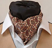
1. Costume:
the costume design in this opening was possibly the main highlight of this spectacle that i wanted to portray. I put a lot of thought into the style and feel of the outfits through much research into western, sci-fi, kung fu and period drama movies. At first, the music video, "Knights of Cyndonia" by Muse had the broadest selection of imagery that i was looking for. afterwards i moved on to fine tuning the ideas, taking inspiration from movies like Mad Max with it's post-apocalyptic futuro-tribe feel and Pirates of the Caribbean with it's heavy use of jewelry, charms and other cultural accessories.
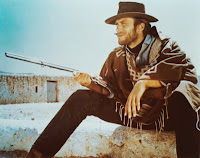
I did a couple of drawings in my sketchbook to visually piece together what i was looking to achieve - a sort of bohemian, rugged mish mash of styles and luckily my mum and dad had a lot of the garments i was after (from way back when they were new romantics and post punks) e.g. cravats, cowboy style apparel and chunky belts. A lot of the clothing also came from me and my friends too - Max (Bandit) had about 5 different ponchos up for selection that he'd bought back from a recent trip to Mexico, I had a real nice pair of desert boots, Levis 501 jeans and some good shirts while Angus (cowboy) had a really beefy leather duster coat - the kind worn by the Clint Eastwood.
When we put all the stuff on it took time until we had it perfect, just how i wanted it, but when we did it was truly cool. check out the photos i posted for a brief glimpse.
2. Lighting:
Luckily where we filmed had these great bright red heat lamps all over it as the space was often used as a scout hut - it gave a nice red highlight upon the actors giving the look a bit of depth rather than blunt white light. it also went nicely with the eventually dropped in space background.
The look achieved from this red tinting reminded me slightly of 2001: A Space Odyssey were the astronaught has to go into HAL and everything becomes super psychedelic.
It was great though as i'd actually forgotten about these heat lamps, so when we did shoot the visuals were accidental but beneficial, giving the genre a slight push in the direction of sci-fi (like Pitch Black with it's multiple different colored suns) but also fantasy (like The City of Lost Children's high usage of tinting).
3. Framing:
I didnt want framing to be such a major role as otherwise i felt the spacey, sci-fi edge could've been lost. also, with the use of bluescreen, actors can be filmed separately but placed together in the same shot therefor composing the imagery out of camera rather than in - this proved fairly tricky but i conquered the issue by placing both actors together in one shot for focus/size/zoom references, then filming them separately for layering them up to match the first guide shot - having them in layers like this was handy though as i could place pyro effects more authentically into the film without them spilling from background to foreground.
4. Setting:
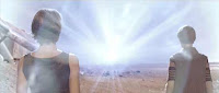
I chose space not for a futuristic feel but rather for a fantasy one. i wanted it to seem more like an otherworldly place like heaven or some kind of shaman afterlife where you could still stand a have realistic physics but there was no ground or walls, just infinity.
It really added to the psychedelia of the film, truly making it visually impressive but also elusive - i partly got the idea from The Matrix, were Morpheus and Neo are in a training sim where all around them is white except a few objects.
It creates a disorientating edge as your eyes dont see ground/wall or sky markers but you mind makes virtual ones through guessing and perspective.
5. Camera shots:
Most of the shots in the film were steadied via a tripod or table top. i ewanted them all to be still as visually you wouldnt really expect hand held motion + blur in a supposedly weightless, stereotypically slow motion space setting - it just wouldn't fit in.
at a couple of points though it was filmed handheld, though very steady so instead of looking wobbly it looks more like a crane e.g. the shot climbing up the cowboy and the overhead one where he strikes a match. surprisingly the shot where it appears that the camera is rotating around him was actually done by keeping the camera still and having him pivot around 180 degrees in front of bluescreen.
6. Transitions:
i didnt use fades from shot to shot. instead i seperated the shots with credits/titles. after the initial introduction of corporations involves the film jumps into the action and the cross dissolves into black background credits stop, being replaced by quick shots of the cowboys cape and beads swaying with his motion, adding a nice sense of fluidity in his motion inspired from kunk fu films like Hero and Crouching Tiger were the motion is turned more into an art form.
this just added to the cool laid back emotiveness the cowboy gives off as it makes his movements calm and collected. in terms of genre i'd stay it sticks close to western aswell as gangster, introducing main characters subtly and smoothly allowing mystique to build up.
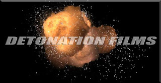
7. Special FX:
The FX was fairly simple to do. i simply downloaded free stock footage from www.detonationfilms.com, then keyed out the black backdrops, allowing them to be placed on top of the footage or inbetween layers of footage as described earlier.
the effects work really nicely - i used them to show the gun firing but also the impacts. i wanted to replace blood with fire, as if the possessed bandits he's fighting are truly demonic. My favourite effect used was a sparkler - when keyed it looked like spewing flames and heat so i used it to simulate a spurting effect from the impact points.
8. Typography:
I chose a simple font for the credits leading up to the main title as i didnt want to detract too much from the other main visual imagery. however, after uploading it was reccomended to me that i shouldve made the text king over the footage as unfortunately rather than looking like an opening it seemed more like a promo. It was sugessted that i should maybe freeze scenes of action and have the credits come in with the same aesthetic style as the background - keeping the theme of free, floaty, stardust like motion.
The main title at the end i compiled on photoshop - aiming to make it look similar to an old video game logo or animation title, keeping a slightly 70's/80's theme consistent. A good example of what i was targeting is the titling of Beverly Hills Cop as the scruffy text and structure has a jagged and action packed feel, fitting nicely with my main array of targeted genres.
5. Camera shots:
Most of the shots in the film were steadied via a tripod or table top. i ewanted them all to be still as visually you wouldnt really expect hand held motion + blur in a supposedly weightless, stereotypically slow motion space setting - it just wouldn't fit in.
at a couple of points though it was filmed handheld, though very steady so instead of looking wobbly it looks more like a crane e.g. the shot climbing up the cowboy and the overhead one where he strikes a match. surprisingly the shot where it appears that the camera is rotating around him was actually done by keeping the camera still and having him pivot around 180 degrees in front of bluescreen.
6. Transitions:
i didnt use fades from shot to shot. instead i seperated the shots with credits/titles. after the initial introduction of corporations involves the film jumps into the action and the cross dissolves into black background credits stop, being replaced by quick shots of the cowboys cape and beads swaying with his motion, adding a nice sense of fluidity in his motion inspired from kunk fu films like Hero and Crouching Tiger were the motion is turned more into an art form.
this just added to the cool laid back emotiveness the cowboy gives off as it makes his movements calm and collected. in terms of genre i'd stay it sticks close to western aswell as gangster, introducing main characters subtly and smoothly allowing mystique to build up.
7. Special FX:
The FX was fairly simple to do. i simply downloaded free stock footage from www.detonationfilms.com, then keyed out the black backdrops, allowing them to be placed on top of the footage or inbetween layers of footage as described earlier.
the effects work really nicely - i used them to show the gun firing but also the impacts. i wanted to replace blood with fire, as if the possessed bandits he's fighting are truly demonic. My favourite effect used was a sparkler - when keyed it looked like spewing flames and heat so i used it to simulate a spurting effect from the impact points.
8. Typography:
I chose a simple font for the credits leading up to the main title as i didnt want to detract too much from the other main visual imagery. however, after uploading it was reccomended to me that i shouldve made the text king over the footage as unfortunately rather than looking like an opening it seemed more like a promo. It was sugessted that i should maybe freeze scenes of action and have the credits come in with the same aesthetic style as the background - keeping the theme of free, floaty, stardust like motion.
The main title at the end i compiled on photoshop - aiming to make it look similar to an old video game logo or animation title, keeping a slightly 70's/80's theme consistent. A good example of what i was targeting is the titling of Beverly Hills Cop as the scruffy text and structure has a jagged and action packed feel, fitting nicely with my main array of targeted genres.

Monday 2 March 2009
feedback - roughcut
-lack of titles make it look as though it is not an opening sequence
-framing is good it all pulls together nicely and shot by shot it creates a good sense of atmosphere
-cowboy music and gun sounds are essential
-colors are vibrant and make the lead character apparent
-pretty phat, like the floating in space feel
-pretty cool effects/screening but its kinda hard to see whats happening
-the colour is far too bright, needs to be slightly darker. bluesceen needs to be taught too
Voiceover script
discussion of your production company name and logo and the role of such companies:
Animatic Studios was chosen as my production company name because the process of storyboarding and animatic editing is something i favor and try to work on as much as possible, i feel it's these pre-visualization methods that benefit most to the connotation of moods and styles when pitching a project.
The logo just came to me when listening to Daft Punk who use a lot of triangular futurist art. The thought of a swiveling pyramid kept occurring to me, eventually leading me on to painstakingly animate it on 10 sheets of lined paper - as soon as i'd drawn the revolution of one face I could loop it as much as I wanted. I photographed each frame and placed them into final cut where it all came together.
I'd say the role of Animatic Studios would be taking a more in depth route of pre-production - working heavily with imagery, research and inspiration, much like a method actor.
the idea of a distributor and who that might be and why:
I think the ideal distributor for this movie would be one that deals mostly with younger audiences as they'd know how to piece together advertisements that attract them - it's likely these advertisements would have a really visual approach and i thinks that's appropriate for a film like this. MTV Films would be a good example.
where the money might have come from for a film such as yours:
Money would most probably have to come from quite a big-time company due to the heavy use of special effects, although this could be a risk as the larger coorperations may not think much about the art of the film, rather the money to be made, therefor intervening with design, story and cast.. I'd say something like FilmFour due to there high budget yet independent look..
why the various people are named in the titles- which jobs appear in titles and in what order and how have you reflected this?:
I didnt focus enough on titles to make this look totally like an opening.. instead it seemed far more like a trailer or teaser.
I wanted costume design to be a big part, mixing in nicely with the visuals. I thought companies like Levis and True Religion would be great as theyre both traditional original Cowboy Denim companies. this product placement would help funding but also marketing as it's likely spinoffs would appear in there adverts and products - much like mcdonalds and there movie popularization ways (with toys, etc).
what your film is similar to 'institutionally' (name some films which would be released in a similar way):
i'd say it'd be released in a way similar to a james bond movie, with products nspired by it, having large impacts on media and advertising styles in the periods leading up to and during it's release.. i think it's popularity should start early with little snippets and promo clips surfacing now and then to build hype, much like Cloverfeilds viral movies.
What's the demographic of your audience and how can we tell from the opening?:
i felt that the movie would appeal more to the rock oriented crowd due to the clothing choice and 1970's film style reference unexplored in most areas of say hip hop/trance..
also i'd say from early teens onwards to 50's as many different aspects of the films themes can be identified throughout the different age ranges e.g. cowboy westerns, Muse (rock band with similar music video), john woo films.
Friday 27 February 2009
Final edit................... another version will follow
if i had an extra day i'd dedicate it to final touches in effects and timing - removing the rubbishness of the glow but this time round i used it to hide the rushed pyro-effects.
Wednesday 25 February 2009
3 targets
for future film making i should:
-make sure physical representations are given to the actors so they know exactly what i want.
-show actors, etc. my blog featuring imagery + moodboard to convey targeted style across to them..
-double check all continuity via storyboard plan.
-make sure physical representations are given to the actors so they know exactly what i want.
-show actors, etc. my blog featuring imagery + moodboard to convey targeted style across to them..
-double check all continuity via storyboard plan.
Thursday 19 February 2009


Tuesday 17 February 2009
demon face
 i'm gonna need to feature an after effects trick called "the demon face" in my movie.
this site'll show me how http://library.creativecow.net/articles/kramer_andrew/Demon_Face_Warp.php
today's shoot
today went so smoothly it was great.
- first we got our bluescreen nice n taught across our studio (max's scout hut). was tough but paid off nicely.
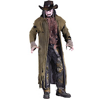
-next was costume design! doin the cowboy was great, Angus (the dude playin him) genuinly looked like a voodoo-ized cowboy - a pretty cool look it has to be said. next was the cherokee spirit bandito bad guys who also look great.
-Shooting happened pretty soon after this and all came together. Was genuinly impressed by ease at which tasks were accomplished. (-:
Thursday 12 February 2009
Wednesday 11 February 2009
Details
possible actors - will be confirmed soon:
-my friend Angus Crawley
-my friend Max Weaver-Lathers (alternative actor)
-me
(i may take on the acting role and get someone else to film if desperate)
Effects:
I'll be using effects for gunshots+gun flashes (some can be done WHILE filming), glitter style effects, auras+trail effects like glows and ghosting, i'll be using blue/green screen throughout most of the movie so that'll require keying effects.
Soundtrack:
I thought a track similar to the one used in my animatic would do nicely - it had 1970's cop thriller/adventure feel to it but then also some pretty good synths making it seem kinda futuristic. it was a similar blend of styles as the film (sci fi/western).
my friends are pretty musical, i could invoice a couple to replicate or do somethin similar to that track.
Wednesday 4 February 2009

Extra imagery


these images shall move past the backgrounds in some scenes behind the characters in the foreground
background imagery


these pics are gonna dropped in as backgrounds via bluescreen in my opening sequence
Items Needed for Costume
 holsters
 guns
guns levis 501 regular fit black
 waist coat (leather preferable)
 studded belt
 hippy jewelery
 belt buckle
 Cowboy boots
 make up (more subtle)
 spurs
spurs
Friday 30 January 2009
Wednesday 28 January 2009
Action Sequence shot list:

1. close up gun being pulled out of holster
2. gun swings into shot
3. close up of barrell > shoots with flash of psychadelia
4. sillhouette spirit shot + falling back
5. high angle shot of cowboy shooting, roley still in mouth
6. low angle jacket swoops past camera reveals spirit and gun > gun shoots spirit
7. low angle of cowboys boots scuffing ground > dust/sand rising
8. birds eye of cowboy lunging forward with pistol
9. whip cut to birds eye of spirit being shot back
10. close up high angle of cowboy (hat covers face) > beads/necklace sway about, roley still in mouth
11. close up of cowboy eye > reflection of spirit
12. transition to shot of spirit > rapid zoom into mouth
13. side close up of cowboy grinning with roley between teeth.
14. whip cut down do boot kicking off ground
15. POV of spirit > cowboys fist approaches
16. flash + fade to black.


Subscribe to:
Posts (Atom)