in what ways does your media product use, develop or challenge forms and conventions of real media products? (i.e. of film openings)?:
Use:
-jumping sttaight into action - like james bond intros
-establishing special effects at films disposal at intro
-keeps main character hidden/unknown, sucking audience in
develop:
-works heavily on over the top FX, almost to comedic level
-outfits over done to comic style, gives more vivid/rapid introduction to styles being conveyed.
Challenge:
-challenges most modern day "gritty" realistic movies and goes for a more naive action packed 1970's styled opening - could be considered ironic e.g. anchorman.
How does your media product represent particular social groups?:
i felt that the movie would appeal more to the rock oriented crowd due to the clothing choice and 1970's film style reference unexplored in most areas of say hip hop/trance..
also i'd say from early teens onwards to 50's as many different aspects of the films themes can be identified throughout the different age ranges e.g. cowboy westerns, Muse (rock band with similar music video), john woo films.
What kind of media institution might distribute your media product and why?
Most probably an advert/trailer sector due to this project showing off more of it's USPs like action and SFX instead of luring the audience in with conventional film title opening sequences.
i also feel rahter than a film company - a series company could adopt it better as the opening worked much like the opening of spiderman or batman, picking up from the comic as everybody already understands the rough plot outline - this is why it is so easy for the film to jump straight into the action.
How did you attract/address your audience?
i researched into many different programs such as Bravestar, deadwood and monkey for visual inspiration, the rock essence came from Muse's MV knights of cyndonia - all of these programs had a childish edge to them, designed to suck in the audience with imagery rather than thought.. generally found more in male targeted media e.g. Shaving adverts... (showing off cool SFX and sound to demonstrate simple things). adverts targeted around the female audience generally have more chatter and less diagrams to them.
What have you learnt about technologies from the process of constructing this product?
-blue-screen must be very taught and lit gently all over from behind+above the actor for the best keying
-trying to achieve 28 days later esque frame rates always results in exposure dipping from reduced light intake on the camera. unless you in a bright room, it'll begin to look underexposed and therefor noisey, messing up keying.
-stick to a minimum of two, AE has brilliant bluescreening tools but is hard to cut with, FCP has ergonomic quick splicing formats. combining the 2 is good for a visually strong end product.
Tuesday 21 April 2009
Monday 20 April 2009
Character comparison
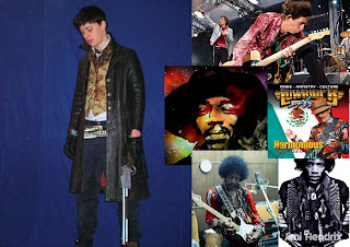
The imagery i associate the cowboy with most is definitely Jimi Hendrix. It was Hendrix that gave me the "VOODOO" idea, through his songs but also his general apparel (beads, military coats, charms, layers and mixes of materials...)
His presence in psychedelic art and style is huge too - everybody would easily associate with the targeted hippie feel of the film having things reminiscent of Hendrix.
Next i'd say Carlo's Santana with his cool 1960's style (waist coats, drainpipe trousers, chelsea boots) he looked great as if the sharpness of MOD mixed up with the beatles SGT Pepper look..
This time it gives it the cowboy look some more..
Finally Keith Richards. He looks like chewed wire. absolutely everything has happened to him and you can tell through what he wears - a very cultural blend of garments that look like he's just picked them off of various morrocan, turkish and south american markets. it was this "travelled" look that i thought suited the cowboy well - after all.. he had ben to a shaman afterlife, hangin out with the amazonian spirits.
Sunday 19 April 2009
Feedback L2
1.
what kinda genre do you think this film belongs to? why?
-fantasy. i think this because it looks and seems imaginary with all the colors and imagery
who do you think the target audience could be? why?
-i think the target audience for this would be slightly older than myself and most likely male
If you were to borrow one idea from this film for your own film-making project, what would it be and why?
-the colors stand out
2.
what kinda genre do you think this film belongs to? why?
-superhero flick/sci-fi/western with rough colours to qualify as a decent stoner flick, because, well he's a cowboy, in space, being awesome and cosmic, while beinfg surrounded by loads of colours
who do you think the target audience could be? why?
-hippies, cus of the psychedelia
Whats your favourite image from the film? why?
the opening shot crawling up the cowboy, it just hits you with the cosmicness of it all..
If you were to borrow one idea from this film for your own film-making project, what would it be and why?
-Green screen
what kinda genre do you think this film belongs to? why?
-fantasy. i think this because it looks and seems imaginary with all the colors and imagery
who do you think the target audience could be? why?
-i think the target audience for this would be slightly older than myself and most likely male
If you were to borrow one idea from this film for your own film-making project, what would it be and why?
-the colors stand out
2.
what kinda genre do you think this film belongs to? why?
-superhero flick/sci-fi/western with rough colours to qualify as a decent stoner flick, because, well he's a cowboy, in space, being awesome and cosmic, while beinfg surrounded by loads of colours
who do you think the target audience could be? why?
-hippies, cus of the psychedelia
Whats your favourite image from the film? why?
the opening shot crawling up the cowboy, it just hits you with the cosmicness of it all..
If you were to borrow one idea from this film for your own film-making project, what would it be and why?
-Green screen
Friday 17 April 2009
equiptment
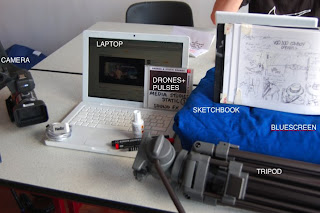
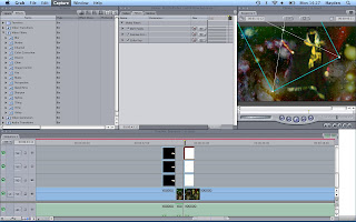
Bluescreen: used for solid color to later key out and replace
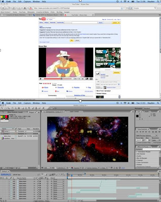
Final cut: used to color correct image to solidify bluescreen color, also used for splicing of film.
Adobe After Effects: Has far better chroma keying tools than FC, so i did all keying in this. i also compiled the spacey background in AE as that Required good Luma keying to remove the black and layer the up.
Camera: used on high frame rate to allow better speeding up + slowing down via frame blending tools.
Tripod: used to gain steady shots and zooms
Sketchbook: used for detailed storyboards and graphics to be inserted in to animatic
Internet; research/imagery/inspiration for mood board. used for sound fx and pyro effects.
Sound CD: used for great drones and pulses used as soundtrack to film.
I've learnt many things about the filming processes of making special effects in that Bluescreen always needs to be perfectly smooth - ironed if possible, as the smallest crease could create a shadow just out of the keying tolerance level, therefor making you have to color correct to gain the highest solidity of one color (blue) and the color correction even though it may fix the keying problem can have negative effects on the rest of the footage (other R/G/B levels too high/low).
Also from this point on, if i need to do keying again i'll always use AE first, THEN FC as i didnt realise the quality difference, eating up my time.
Tuesday 14 April 2009
Feedback Final
-work on titling via incorporating it into imagery/pyro effects - similar to gangster film with freeze frames and credits maybe. bend music to fit titling more than actual subject to accentuate OPENING feel rather than promo/teaser feel..
Monday 13 April 2009
Continuity task onwards
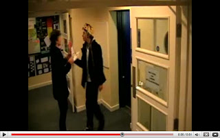
from the continuity task we filmed aaages ago, we've progressed a lot. I found that the best way to have continuity coined is to have some kind of plan that you work to e.g. a script, storyboard, etc as then you can identify any errors beforehand and work around them.
The voodoo cowboy had no continuity errors as i followed this method throughout, shooting extra long shots for additional splicing time if needed.
I had a couple of errors in the actual filming (positioning and speed) but thats where the animatic came in. i showed it to the actors and though that they could time their movements nicely - fitting in well with what i planned.
Subscribe to:
Posts (Atom)
